A typography-led system designed for clarity, standout and scalability across a complex advertising environment

Creative Direction / Visual Identity / Art Direction / Typography Systems / Motion Direction / Design Systems / Omni-Channel Campaign Rollout
A refinement of the William Hill visual identity designed to improve clarity, standout and flexibility across a high-volume, multi-channel advertising ecosystem.
Developed around a typography-first approach, the system was built to scale across retail, digital, CRM, sponsorship and OOH while supporting faster production and clearer communication.
The Challenge/
The previous system had become overly rigid, resulting in work that often lacked standout across a crowded category.
Examples of the previous visual identity
Typography was confined to fixed containers, forcing photography to fill leftover space rather than working cohesively with the layout itself.
Three key challenges emerged:
/ Work lacked cut-through and distinction
/ Restrictive layouts diluted propositions
/ Output felt overly polite and low energy
And new pressures were emerging:
/ Fewer media placements
/ Modular self-serve systems
/ Messaging complexity across channels
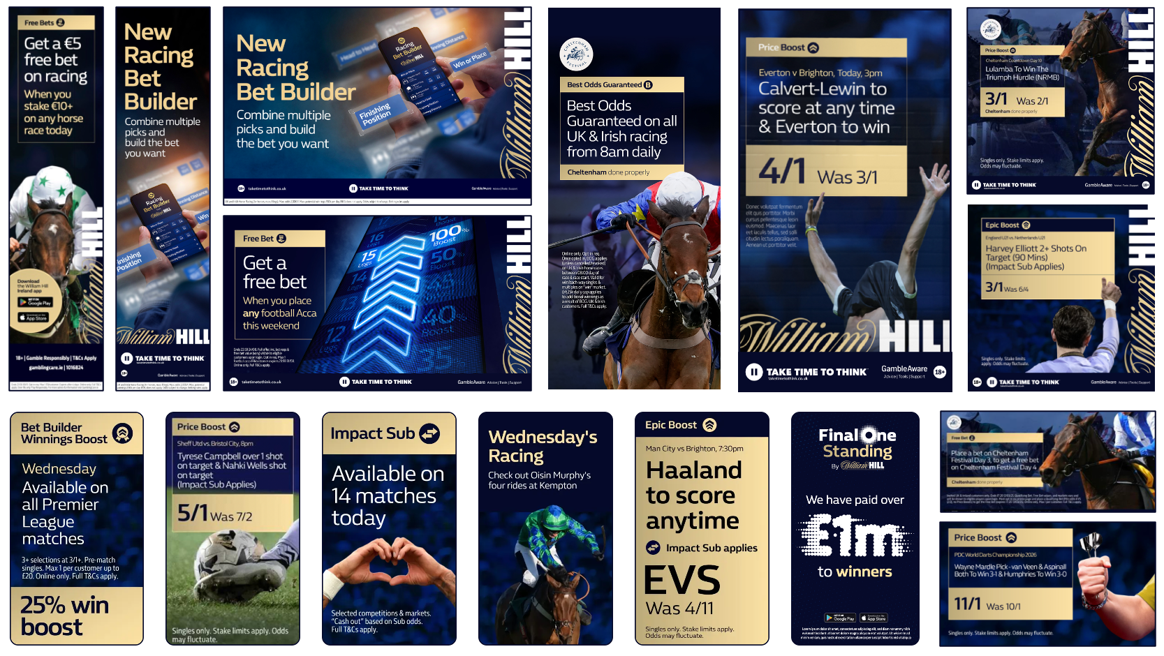
From rigid layouts and restrictive hierarchy to a more expressive, typography-led system built for clarity and standout
The Idea/
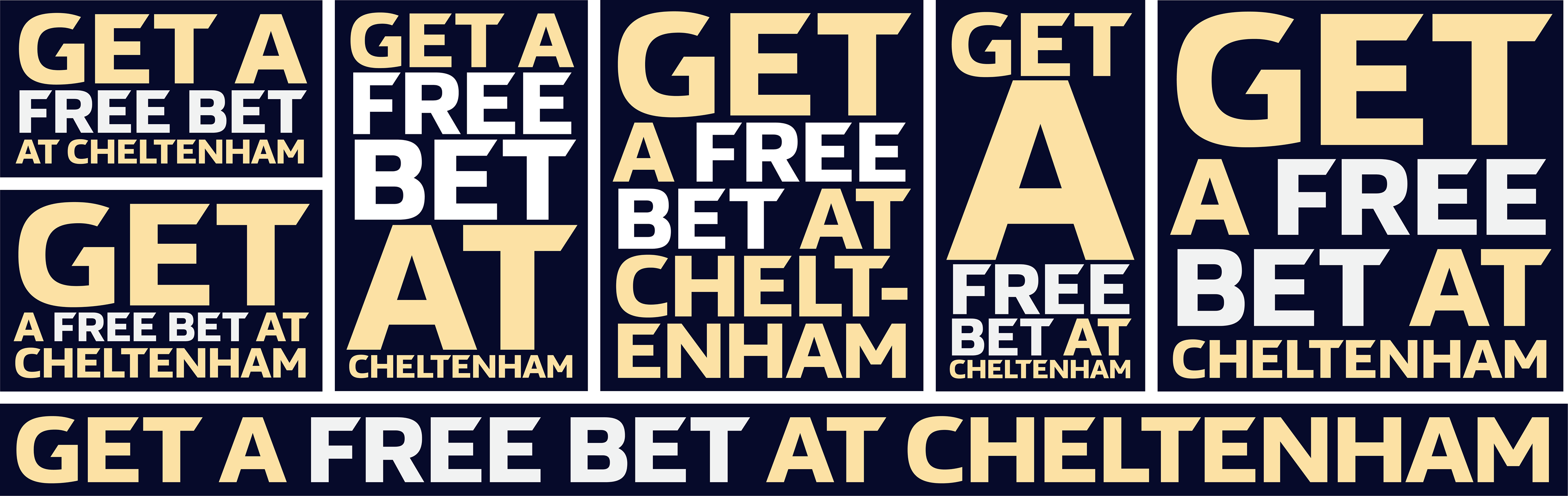
Flexible messaging using blocked type
Typography became the system, not the container
Inspired by old-school boxing posters, the system uses expressive hierarchy and typography to guide attention while allowing messaging to flex naturally across formats. Consistency lives in the ingredients, not the layout itself.
The System/
A typography-led system built around hierarchy, flexibility and clarity
/ Typography flexes to fill space with controlled hierarchy
/ Photography supports messaging rather than leading it
/ Blocks act as a focused container for propositions
/ Colour is used for clarity and distinction, not decoration
/ Outputs share one system with controlled elevation for key moments
/ Consistency is achieved through behaviour, not fixed composition.
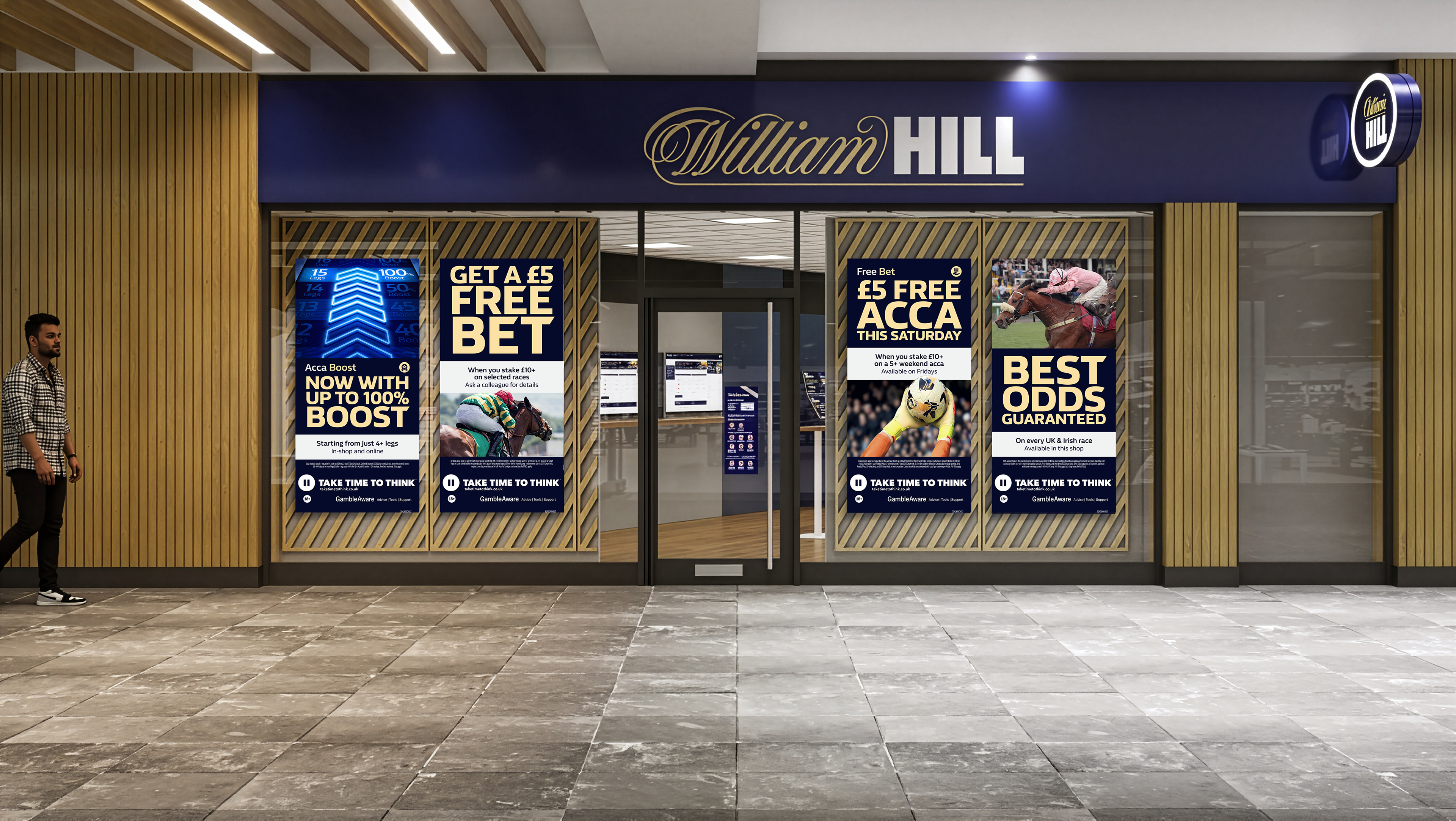
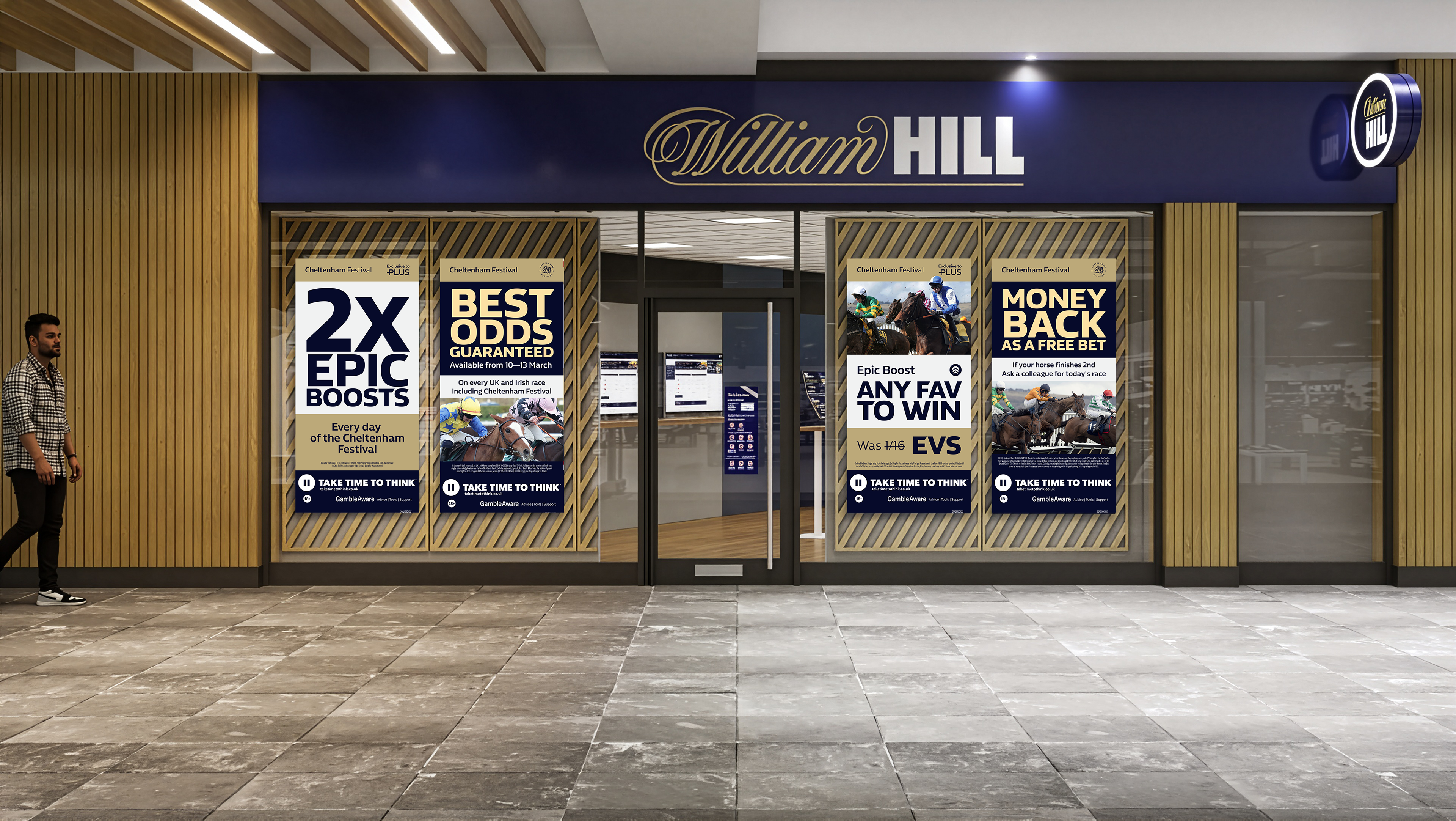
Retail window executions designed to maximise standout and clarity from the street.
Rollout/
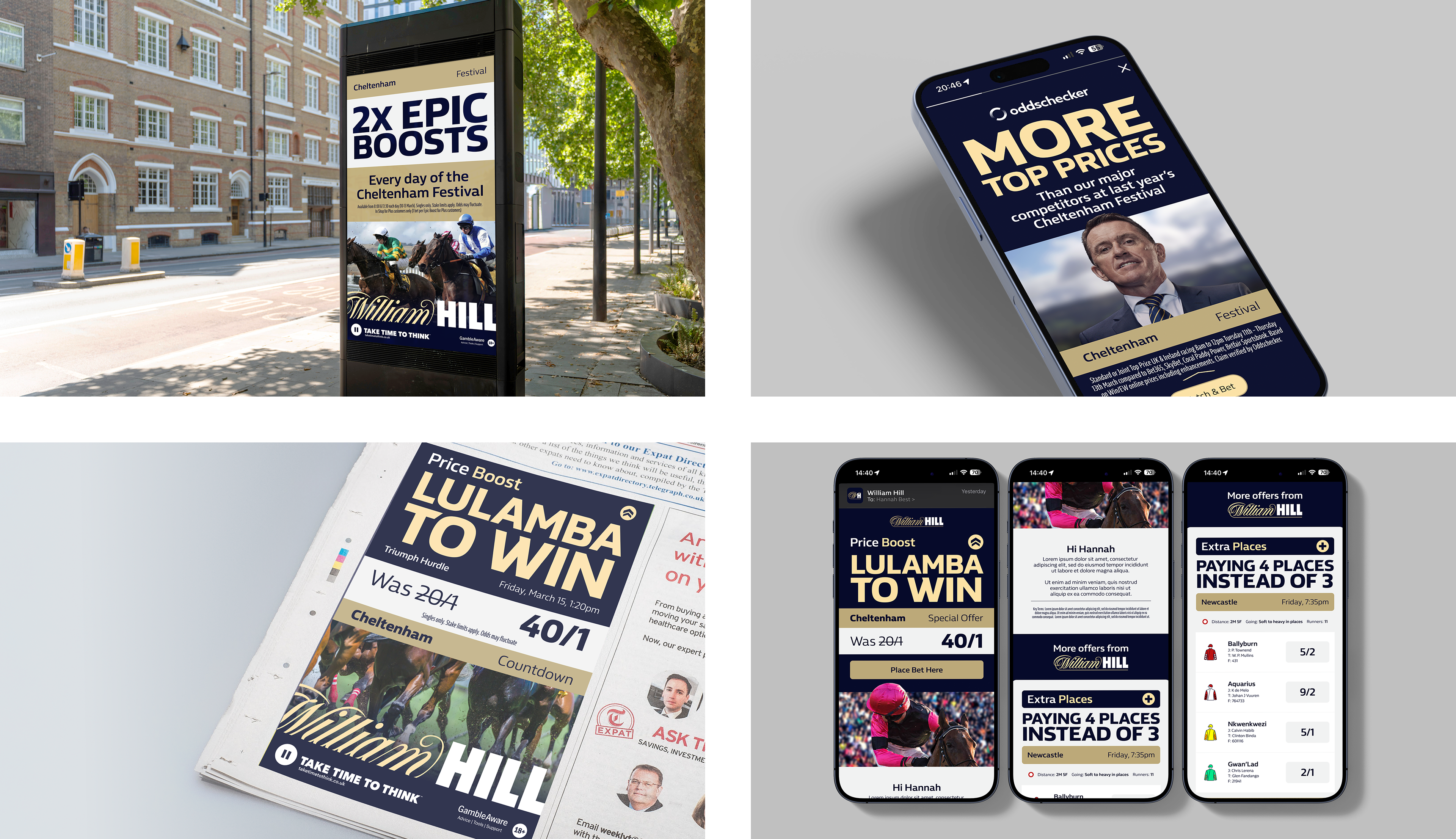
The system operated across both BAU and campaign output at scale and was applied across multiple propositions, formats and channels including:
/ Retail (Window Posters, Merchandise)
/ Onsite (Self-serve Systems)
/ CRM (Modular Content Blocks)
/ Press (Multi-Format Advertising)
/ OOH (UK & Ireland)
/ Sponsorship (On-course Branding)
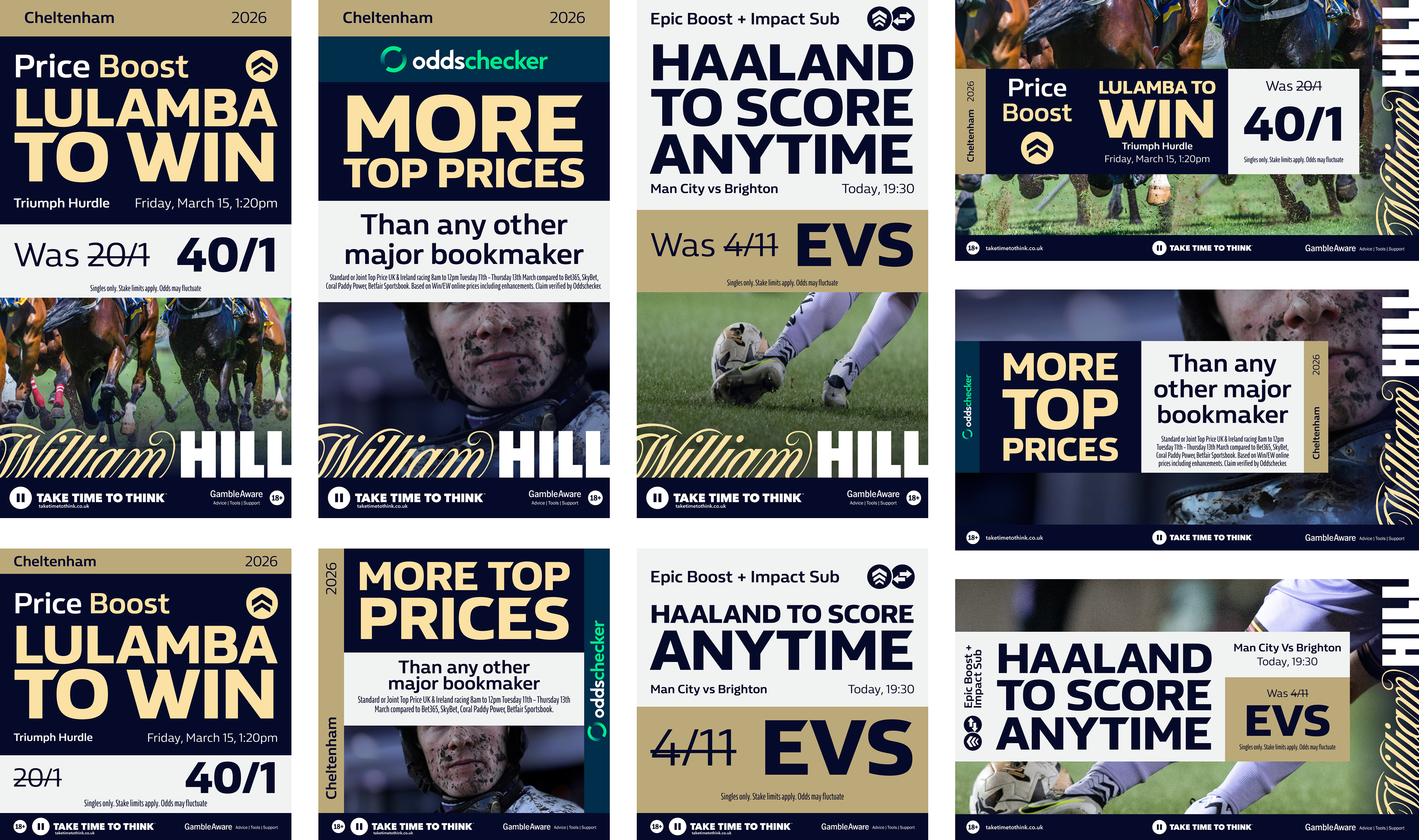
The result is a system that feels consistent without becoming repetitive.
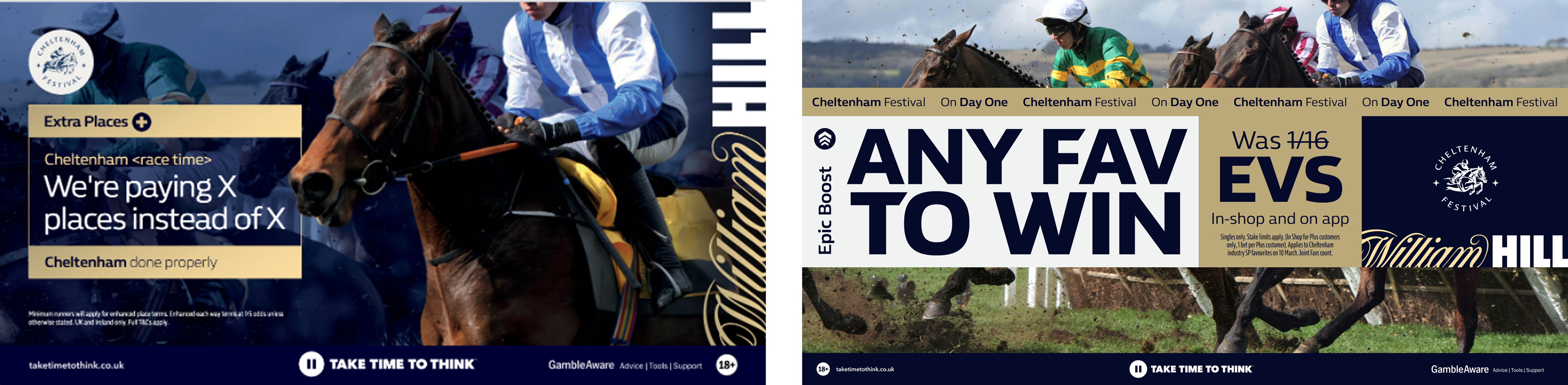
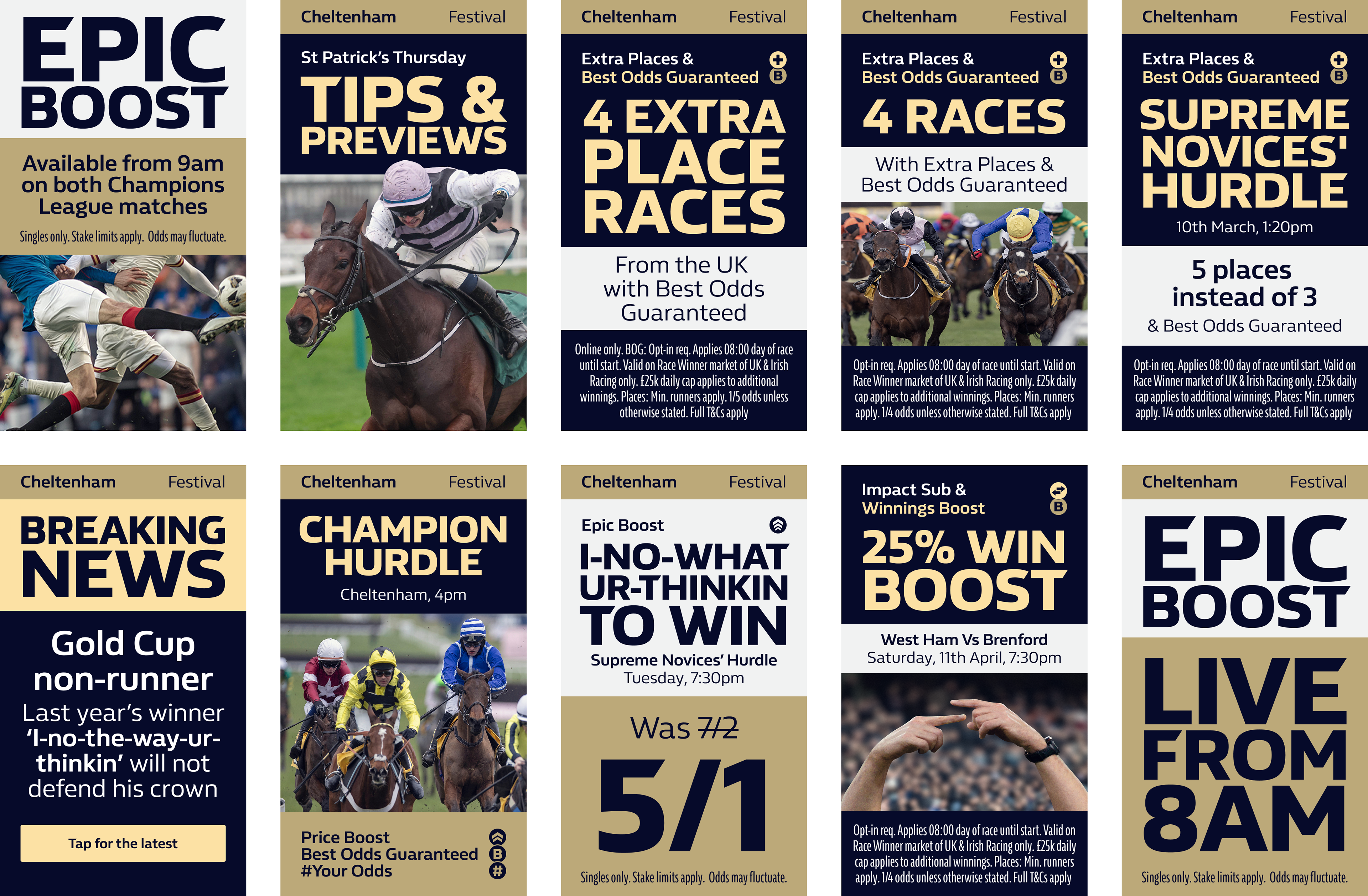
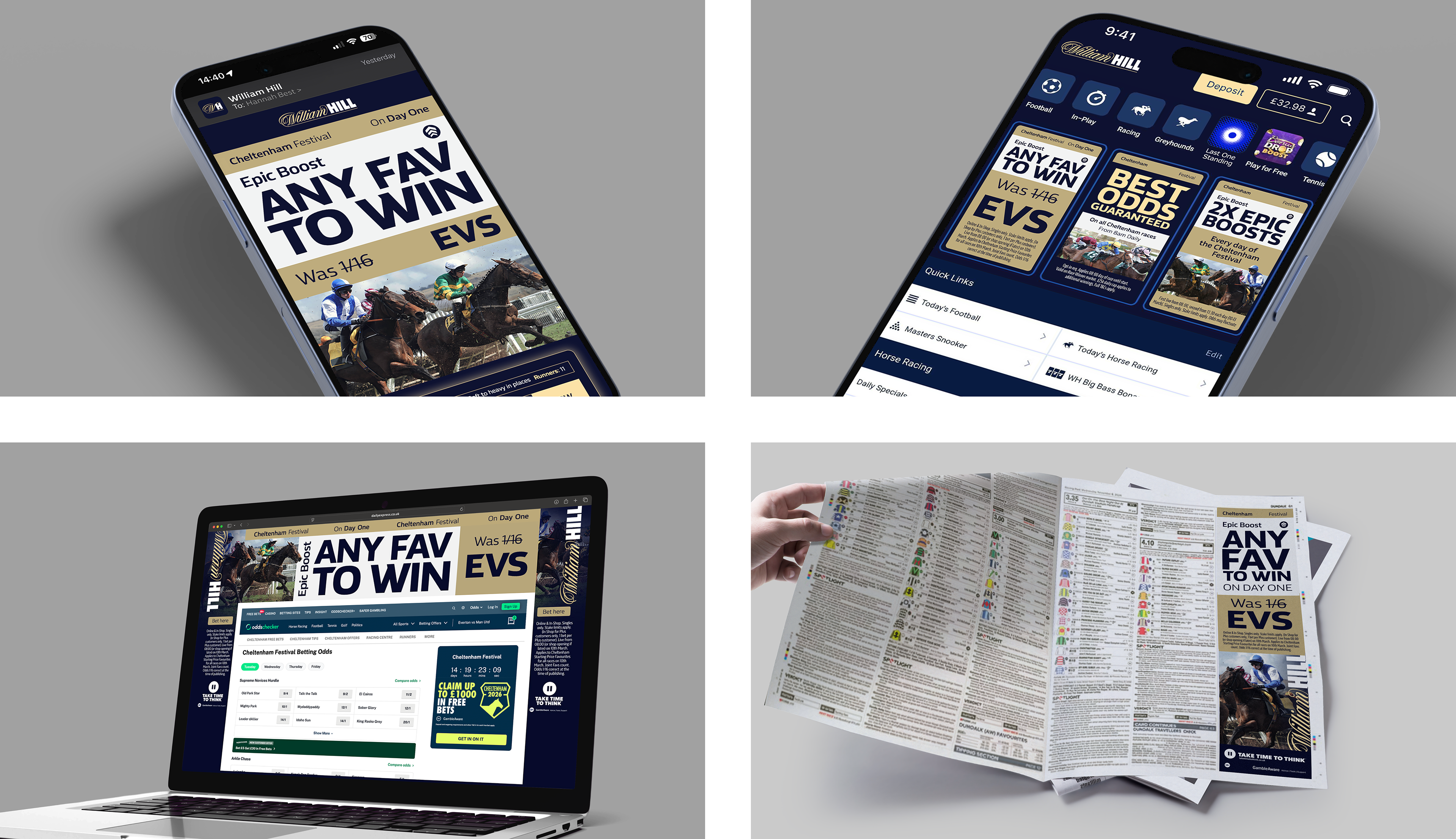
Cheltenham Festival/
The first major rollout and stress test of the system
Epic Boost was elevated through a simple colour inversion, increasing standout within a crowded promotional environment. Photography shifted from generic sports imagery to more atmospheric, on-course visuals, capturing the energy of Cheltenham itself. The campaign demonstrated the system’s ability to scale while elevating key commercial moments.
Motion/
Motion extended the same principles as static design
Typography led storytelling, with VO broken into structured beats to improve clarity and pacing. Hierarchy replaced picture as the primary driver of communication across social and broadcast.
Impact/
The system delivered clear improvements across creative and operational output:
/ Stronger standout across competitive environments
/ Clearer communication of propositions
/ Faster production through Figma-based scamping
/ Improved responsiveness to trading requests
/ Successful integration into Bannerflow self-serve workflows
/ Strong internal validation from senior stakeholders
/ Enabled teams to produce more consistent creative at speed across channels.
In a noisy industry, impact isn’t about shouting louder — it’s about saying less, clearly.